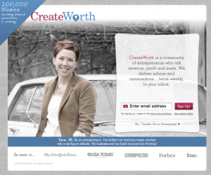
Awesome landing/squeeze page analysis
 Stumbled across Create Worth and was literally WOWED by this landing/squeeze page. It’s striking, informative, has a perfect call-to-action, and it looks beautiful to boot.
One of my favorite parts of it is the “No thanks! Go to Homepage” link — too many signup forms like this don’t include the option to get out of the page but still see the site content and that drives me nuts!
Of course the reason for not giving any options OTHER than signing up is to try to force more conversions, but in my opinion, if your target audience is web-savvy, giving them the “no thanks” option will lead to more loyal readers/fans and therefore more valuable conversions long-term. I had no idea what this site was about when I landed on this page, so I clicked through the “no thanks” link first, poked around a bit, and then went back to sign up. I even agreed to receive their two other prompted products afterwards. I’m not sure I would have signed up at all if the “no thanks” link hadn’t been there.
On the other hand, one thing I think they’re doing wrong is having the “as seen in” logos link out to the coverage on external sites. And those links aren’t even opening in a new window! That’s a sure-fire way of losing people’s attention. If I clicked through to the Times article, what are the chances I wouldn’t be sucked into something else on the Times site and never hit back to actually sign up? Much too big.