Sanebox: A site full of personality
 Just came across SaneBox today after reading about it on a friend’s blog, and I signed right up. A service that will make my disaster of an inbox sane? Yes please!
I can’t speak to how well it works as it’s still “analyzing” so I haven’t actually used the thing yet, but that’s not what I want to talk about anyway. This post is about the design of the site and how it immediately won me over with its playful design.
On the “about” section of the site it says that none of the guys behind the product are designers, but they sure fooled me! I love the hand-drawn elements, the blue character with his crazy facial expressions, and the playful, almost silly ad copy.
Take this “how it works” graphic for example:
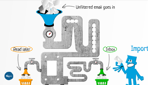
The concept it’s illustrating is pretty simple, but there’s no obvious way to visualize it. They could have made a simple graphic with just three arrows in it, but instead they went for this brilliant Rube Goldberg-type image. In one glimpse it tells you everything you need to know: how simple it is for you and how complicated what they’re doing behind the scenes is. And it conveys all that without taking itself too seriously. That’s really hard to do!
If you were being snarky, you could say that it’s not a very refined graphic (look closely at how the blue funnel connects to the gray machinery area, and how the envelopes are a totally different style of drawing than the rest of it), but I think that’s part of the charm. It feels real. Not stuffy. And the focus is on what the service does, not on business speak.
Assuming the product works as well as the site’s branding does, I’m going to love using Sanebox for sure!